I think I am the world’s worst decision maker! No, but seriously. I have spent hours, days, WEEKS pouring over websites and wallpaper samples. Everything that I found was either the wrong color or ridiculously expensive (like $195.00 a roll expensive) Then, while purchasing some Benjamin Moore paint for the bathroom vanity today, I stumbled across some fabulous wallpaper books. First of all, let me preface this blog post by pointing out that this isn’t your grandma’s wallpaper. I am going for something textured and metallic. Something that will give the room a splash of style. Something that will bridge the gap between modern and vintage. My plan is to find a great wallpaper to paste in the small nook wall behind the TV and also carry that wallpaper over to the dressing room. Now, keep in mind that the bedroom walls are being painted dark gray, the furniture is cream colored, the woodwork is dark brown, there is reddish brown exposed brick to deal with, my accents are brushed nickel, and the flooring is long cream colored shag carpet. OH! and I also have to keep this room masculine enough so that Raul doesn’t run away screaming. Friends, help me pick a wallpaper!!!!
Post your favorite in the comments section!! And be quick about it, too! 20% off sale ends at Connolly’s on May 1st!
xo


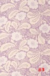


I’m voting 5 and 9 because they’re neutral enough that I think you’d be able to pull all the stuff together. I also think their fancy yet simply enough to add visual interest/depth, but without taking over the room.
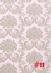
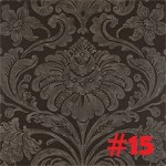
1 or 15
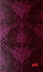
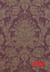
If I went in order, it would be 5, 6, 10. Ten would be second choice but can’t really see that we’ll. 6 would be my top choice but depends on the tone of red. Here it looks slightly purple which is to girlie but if it is a more sexy/romantic red then I would choose that.
I like 10 but I can’t resist telling you that I once wallpapered a bunch and midway through I told those closest to me to smack me if I ever tried to wallpaper again. I thought that after I was finished this sentiment would change, but it didn’t. It remained one of the worst ideas I ever had. 1. It’s a major pain in the ass to do. 2. If you have problems with it later (rips, scratches, peels, kids color on it, etc) it is a major pain to fix. 3. When you decide you want something different (even if it’s years later) you will rather scratch your eyes out than take it off.
ok. you didn’t make it easy with the choices lol BUT I really like #1 best. It’s very neutral and you could put just about any sheets and pillows and furniture you want with it. you could change the colors in the room versus always trying to match your walls instead. aaaahhh 11% bat life left! ok … but i like 1 because it has that modern vintage not old feel. if your walls are gray too the white will make it stand out and brighter vs. the darker colors. AND it has that soothing relaxing feel with the grey tones enhancing everything else you have. and like i said you can add a variety of splashes of color with sheets, pictures, lamps, pillows, bathrobes 😉 tu sabes hehehe
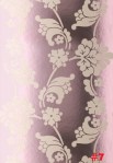
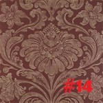
I think #14. Right next to 14 is the darker gray of #15 which you said your wall color will be. Next to each other, the colors seem to go well together and i think that 14 has just enough of a color to it that it will also bring out the color of the exposed brick.
Go Big or Go Home! I love #6, if I had all that beautiful woodwork I would do it big!
So I really like 1 because it’s so pretty and hopes with any accent color . And it’s so fitting for a Victorian house but it doesn’t look like your great grandma picked it out lol 😉 I love the 5th and the 11th one also . Both are really complimentary . But you want something you can kind of change up a little bit so I think that one is a good pick 😉
I think #8 is very elegant, and very neutral to blend in with everything. Especially is you want to change on color later on without changing the wallpaper (in which you have my total sympathy on costs as I am looking for some myself).
9 or 11…but they are all great! Suerte mujer.
I’m voting for #1 or #15. Good Luck on your decision..Hurry sale ends soon!! Lol.
Such a hard choice! I like them all, but love #1, #5, and #13! I guess it depends on what other colors you’re choosing to accent with also.
Just stumbled upon this blog of which I am loving, by the way, and I must say, I like your designs, but I hate wallpaper. I am in the midst of steaming off some off my kitchen. So take my opinion lightly. As far as the ones you have…I like them all for a scrapbook.
Sorry.